There are cars that feature some of the most beautiful steering wheels in the automotive world – many of which can be described as works of art. Just think of the Spyker C8’s, the Chevrolet Corvette C1 Series 2’s and of course – possibly the prettiest of them all – the Pagani Huayra’s aluminum, carbon-fiber, and leather coated helm.
Then there are cars like the Ford Fairmont XE Ghia, with a lop-sided, uncreative, ugly steering wheel. Or the Dodge Neon’s – which is probably the least imaginative and uninteresting one in the motoring world. Some manufacturers decide on interesting designs to help spice up their car interiors – many with great results, like the Renault 5 Turbos with its equally bonkers dashboard, seats, and colors.
Here are nine production cars that have the absolute ugliest and most boring steering wheels in the American motor industry – and one that isn’t a wheel at all.
10 Chevrolet Cavalier
The Chevrolet Cavalier was a small sedan and coupé, produced between 1981 and 2005. The name was revived for a China-only model in 2016, and an even newer model is being sold in Mexico since 2019. The 1995 to 2005 Cavalier featured engines ranging from a 2.2 to a 2.4-liter, a choice of between a 3- or 4-speed automatics, or three different 5-speed manuals.
The car’s design was heavily influenced by other cars of the late 1990s but was more on the bland and boring side. The ugliest feature of the car, however, is the steering wheel. It is a four-spoke wheel, with all four facing downwards in a sad-mouth style. As the single object, the driver will be looking most at, it is quite an awful design.
9 Saturn Ion
The Saturn Ion was a terribly boring and generically-designed car. It was offered in either a sedan or four-door coupé body style, with the coupé being the more interesting by far. The top of the line Redline Edition was fitted with the engine out of the Chevy Cobalt SS, with 241 hp, 218 lb.ft of torque, 2.0-liter inline-4, with power going to the front wheels only via a 5-speed manual.
Just like the exterior, the interior was just as uneventful – apart from the steering wheel, which is one of the ugliest of the era. It was round – like most traditional steering wheels – but with the center part where the airbag is housed also being round. The wheel featured two spokes, both below the center line and emulating more roundness in the form of buttons. It looked truly terrible.
8 Dodge Neon
The Dodge Neon, whilst not an entirely exciting car, has a rather large cult following, especially with the top-spec SRT-4 trim. Whilst the SRT-4 has an uneventful three-spoke wheel, the normal Neon features probably the least interesting steering wheel in existence.
It is a four-spoke, with the NEON name embossed in the middle. That’s it. There are no buttons, no flashy trim nor anything of interest to look at – just a round hump of molded plastic to steer the otherwise okayish car with.
7 Ford Fairmont XE Ghia
The Ford Fairmont XE Ghia is an Australian full-size sedan, built to do battle with the Holden Commodore. The Fairmont looks like a larger version of the Cortina and featured a 351cui V8 in the XE Ghia. Whilst the Fairmont looks exceptionally 1980s in design, the interior looks pretty good for a car of this era.
The downside of the interior – as you can guess by now – is the steering wheel. It features a two-spoke design, with both spokes being quite thick and right next to each other. This is all well and understandable, but the spokes sit at an angle to the rest of the interior. This makes the wheel look completely out of place in an otherwise square-shaped cabin.
6 Tesla Model 3
The Tesla Model 3’s design is all about minimalist elegance. Less is more. This sounds great, but as a result, the inside of the Model 3 is flavorless. Everything has to be operated from the massive central screen, including the driver’s instrument cluster and even the glove box release.
This can be forgiven, but Tesla went one step further and made the Model 3’s steering wheel even less cluttered by only putting two unlabeled buttons on it. Granted, these buttons do change their functionality based on the specific menu chosen, but the wheel as a whole just looks like a piece of hard plastic. Unfortunately, the Model 3 was only the start of Tesla’s terrible wheel saga.
5 Ford Crown Victoria
The Ford Crown Victoria is a legendary car. It has probably had more silver-screen time than any other car in existence thanks to it being a favorite of the US taxi companies and police forces for many years. It was sturdy, dependable and features a 4.6-liter V8 for good measure.
The interior design was more utilitarian than sedans in the same class, but this added to the appeal for use as public service vehicles. Whilst the dashboard design is nothing to write home about, it was the steering wheel that stood out – or rather didn’t. It was a weirdly designed two-spoke, which again, just looked like a hump of molded plastic. Whilst it is ugly, it’s even more boring to look at.
4 Ford GT
The Ford GT was Ford’s attempt at making a supercar. The first generation GT from 2004 was built to commemorate the original 1960s racecar, and was available for anyone to buy. It wasn’t all that expensive either, as it was a parts-bin special – and it even had the engine out of the SVT Lightning pickup truck!
With the newer GT, Ford did something completely different and made the car exclusive and very expensive. All this whilst still having the engine out of a F-150 Raptor. Yes, it made 647 hp, but it didn’t sound particularly interesting. The interior resembled a supercar’s, but the steering wheel looked like someone at Ford took the Crown Victoria’s, added more buttons, and pasted a GT badge onto it.
3 Chevrolet Malibu
The 2005 Chevrolet Malibu was a dreary car. It had a neutral interior – not particularly ugly or pretty, not interesting and featured no exciting buttons at all. The engine choices were on the boring end of the spectrum as well. The most interesting part of the whole car was the Malibu MAXX hatchback – which looked like someone backed a Malibu sedan into a wall and left it unfixed to go into production like that.
Then we get to the steering wheel. It looked like a body without a head. The four spokes sat parallel and perpendicular to each other – completely horizontally and completely vertically. It looks odd and, to be brutally honest, quite horrendous.
2 Mercury Cougar
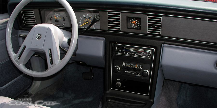
The Mercury Cougar was always considered to be the more luxurious, more comfortable version of the Ford Mustang. As such, the interiors were different to fit the class of cars, with the Mustang being the cheaper of the two. This was not the case with the 1983 to 1988 Cougar – which is one of the ugliest cars of the era.
The sixth-generation Cougar featured a two-spoke steering wheel, with both spokes coming from the bottom. The resulting design made it look like a handlebar moustache, or a clown with sad-face make-up. Thanks to these remarks, the steering wheel is referred to as the ‘sad clown handlebar moustache’ by members of the automotive community.
1 Tesla Model S Plaid
Finally, we get to the Tesla Model S Plaid. What a monster of an electric car – producing 1,020 hp from three electric motors, pushing the car from 0-62 mph in a smidge over 2 seconds and topping out at around 200 mph. It truly is an amazing car to have on the market.
But then Tesla went and did the traditional Tesla thing and added a weirdness to an otherwise brilliant car. In the case of the Model S Plaid, it is a yoke. Yes, a yoke, because the Plaid is as fast as an airplane apparently! Whilst it is an interesting feature in an already interesting car, the yoke is probably the ugliest steering wheel of any car currently on sale. One can be excused if thinking that designers are getting paid enough to make a better effort. Luckily Tesla offers a traditional steering wheel option as well – which unfortunately is still quite unimaginative.
Read Next
About The Author



More Stories
Investigation launched into complaints of Tesla steering wheels coming off mid-drive | Tesla
Wheels Car of the Year 2023: Finalists revealed!
Why Were so Many Built?